password: media
http://www.inclusiveclassrooms.org
I chose this site because it was the first one to come up when I searched sites in the education categories, and the title sounded interesting.
This website focuses on making classrooms more inclusive to support all types of learners to be able to participate and thrive in the classroom environment.
The site is pretty straightforward and easy to navigate. There are some interactive areas, such as the image under the inquiries menu, and some videos. One interesting one reminded me of the one that we watched a few weeks ago,
“The Teachers College Inclusive Classrooms Project (TCICP) supports research, teaching and service to create educational practices that support all students to grow and thrive in their classrooms. Our philosophy is grounded in the understanding that all students can participate in the general education curriculum when provided with appropriate supports and services. We believe that the single-format lesson does not support the full and diverse range of learners in any given classroom, and that teachers need to develop the skills and dispositions that address each and every learner. Teachers with the skills, disposition and support to teach every learner can and will teach every learner. As a project we strive to support teachers’ development of their own classroom practices to teach diverse learners.”
Posted in Uncategorized
Static graphics or animated graphics: which is more beneficial to learning?
My first thought is that I prefer animated images to static ones. However, there are some occasions that the static image is helpful, such as with a complicated process, having the static image in front of me to take my time studying it and to review as many times as necessary may be more beneficial that a fleeting animation.
Ideally I would like to have both static images and animated images presented to me when learning something new. That way I could watch the animated to get a full overview with all of the microsteps, then use the static image as a guide and a reminder.
Here is a cute video to show a child how to tie a shoe. I think the video would be more helpful than the step by step static images in the link below the video.
Watch Cowboy Roy Show A Shoe How To Tie Itself
Step-by-Step Static Images
http://wondertime.go.com/learning/article/how-to-tie-shoes.html
Posted in Uncategorized
One of my favorite sources of educational art videos is Art21 by PBS. This site is such a great resource of contemporary artists. This particular video is about artist William Kentridge. It is about an hour-long, but I would recommend watching the first 5 min or so because it covers a couple of my favorite examples of his work. It shows what I think is some of the more interesting thing that he does, primarily 2D medium, he is a good artist to show students because he uses simple drawings and paper to create short films and tells stories. His charcoal videos are beautiful. He starts by drawing an image, then erases and adds to the drawing to make a stop motion sort of animation. I love that you can still see some of the previous marks, so that a character will leave a trail as it moves.
Posted in Uncategorized
I would like to see the Did You Know 2.0 video with more current statistics than those from 2006, I tried to find one with no luck…One video claiming to be Did you Know 2011 was still using the old statistics. The video references Myspace, I wonder how it compares to today with Facebook. Still, I did find this video very interesting and entertaining. My favorite part was towards the end where it says “We are currently preparing students for jobs and technologies that don’t yet exist…in order to solve problems we don’ even know are problems yet.”
I liked the Pay Attention video more, I liked that it often had the source of the information at the bottom of the screen. It had interesting ideas on how to better engage students and to utilize technology that the students are already know how to use and enjoy using and bringing it into the classroom, making the information more meaningful and interesting to them. There are so many benefits to using technology to teach and this video touched on the subject nicely.
Posted in Uncategorized
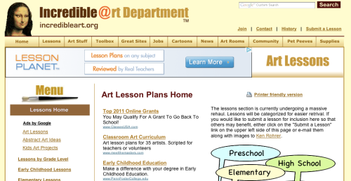
I use this site every once in a while. It has some useful information and lesson ideas. It has a similar concept to my that of my course project but even though I do use this site, I don’t really like it.
I’m not sure what exaclly it is that bothers me, the dull color scheme, or the cluttered layout, or the over whelming number of drop down page choices. I want my site to have useful information, like this site, but I want to have the information in a more organized and less cluttered layout…and a better color scheme. 
Learn Out Loud

This website has podcasts for every subject area. Being an art teacher I chose to listen to the ones in the art history podcasts.
The first on the list is about the painting titled, The Gleaners, by Jean-Francois Millet. It begins by stating the name of the painting, the period, and the art movement it belongs to. The narrator then describes the work, giving the listener a vivid mental picture, almost like the start to a story, describing the characters and what they are each doing and wearing. Many details the viewer may not have noticed other wise. Students may only look at a work for a minute or two, this podcast is about 5 minutes long, and held my attention through the thoughtful analysis. I also liked that the image is available on the page but isn’t visible while you are listening, unless you open the file separately yourself, so that you can fully use your own imagination while listening and look later if you choose.
Posted in Uncategorized
I was looking for good and bad use of text and images on a website. Here is what I came up with:
Good:
I like wikipedia’s simple layout, not overly cluttered. Clear and easy to use. The clean white background allows the user to focus on the text, which is dark (black and blue) and easy to read against the background. There are not too many choices of where the used should go from here, either choose a language or enter what you are looking for in the search bar.
unlike….
Bad: www.about.com

This website is overwhelming. There are way too many images and text. They have filled an entire page with blue hyperlink text, 5 columns of it! Nobody wants to scan that much text to find what they are looking for. They have used every color possible when listing the various categories. This could have been done in a simple list form.
Posted in Uncategorized
I love to read good old-fashioned books. Libraries are some of my favorite places.
When I started to think of how I would like to cross traditional text with hypertext, my first thought was that it would be wonderful if while I was reading a book, if I came across a word I was unsure of I could simple click on it and get the definition rather than stopping to find a dictionary. Or if a character appears and I can’t remember exactly who they were earlier on, I could click on the name for a quick bio summary. I think someone might have told me it was possible to do something like that, at least as far as the dictionary part, on a Kindle. I’m not sure how I feel about eRaders yet. There is just something special about holding a book, measuring the remaining portion with your thumb.
As for what to take from traditional text and implement in hypertext. I like to take notes while I read, even just making little marks next to a passage I enjoyed. Maybe if the passage could become a hyperlink to the notes I made about it, so that the part of the text as well as my notes could be easily accessed together later.
Posted in Uncategorized
At first I had a hard time thinking of examples, but after re-visiting some of the web pages I use often I came up with a lot of good and bad examples. Here are my top choices:
Good: www.BrainPOP.com
I have used this site numerous times in my classes. BrainPOP is a site of educational animated videos and games broken up by subject and subcategories. I feel that it is both kid and adult friendly. It is visually appealing to kids with its bright graphic and animations but it is not so overwhelming that it would be difficult to navigate. Everything is organized well and clearly labeled so that things are easy to find. And once you have gone to another page you can find your way back or to a new section quickly.
Good: www.thisamericanlife.org
This American Life is my favorite podcast. Their website is simple and sleek. The site it colorful in a uniform, pleasing way and the menu bar across the top is easy to navigate with everything at your fingertips. I also like that when you do click on one of the menu choices the central information changes but the shows emblem on the left and the menu across the top stay the same, consistent and again, simple.
Bad: www.yahoo.com
I’m sure there are worse examples out there (in fact I found a whole website dedicated to it! http://www.webpagesthatsuck.com) but I wanted to list a website that I actually use on a regular basis. The only reason I do use Yahoo is because this is where I made my first email address about 14 years ago, and I continue to use this address in addition to more recent ones like my Gmail account.
I don’t like anything about the Yahoo homepage. It is too cluttered and I find it distracting. The page is broken up into sections across the top, the middle, the left and the right, all filled with links and images, some scrolling and flashing. I go to check my mail but instead I end up spending 15 minuets reading the headlines for the day, or clicking on some silly link. Once I have done that, I have a hard time getting back to my mail and have to start from square one.
Bad: Yale School of Art http://art.yale.edu/
Now I know that this site is a Wiki and that anyone with a school ID can add to, or alter it, but why would you allow your department to have a site so horrific to look at? I don’t think its necessary to explain what makes this page so bad. My main complaint is the colors that make it almost impossible to read let alone look at.
Posted in Uncategorized