I was looking for good and bad use of text and images on a website. Here is what I came up with:
Good:
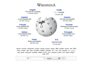
I like wikipedia’s simple layout, not overly cluttered. Clear and easy to use. The clean white background allows the user to focus on the text, which is dark (black and blue) and easy to read against the background. There are not too many choices of where the used should go from here, either choose a language or enter what you are looking for in the search bar.
unlike….
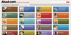
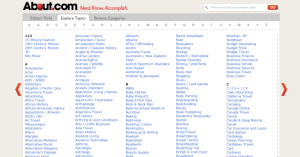
Bad: www.about.com

This website is overwhelming. There are way too many images and text. They have filled an entire page with blue hyperlink text, 5 columns of it! Nobody wants to scan that much text to find what they are looking for. They have used every color possible when listing the various categories. This could have been done in a simple list form.


