At first I had a hard time thinking of examples, but after re-visiting some of the web pages I use often I came up with a lot of good and bad examples. Here are my top choices:
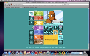
Good: www.BrainPOP.com
I have used this site numerous times in my classes. BrainPOP is a site of educational animated videos and games broken up by subject and subcategories. I feel that it is both kid and adult friendly. It is visually appealing to kids with its bright graphic and animations but it is not so overwhelming that it would be difficult to navigate. Everything is organized well and clearly labeled so that things are easy to find. And once you have gone to another page you can find your way back or to a new section quickly.
Good: www.thisamericanlife.org
This American Life is my favorite podcast. Their website is simple and sleek. The site it colorful in a uniform, pleasing way and the menu bar across the top is easy to navigate with everything at your fingertips. I also like that when you do click on one of the menu choices the central information changes but the shows emblem on the left and the menu across the top stay the same, consistent and again, simple.
Bad: www.yahoo.com
I’m sure there are worse examples out there (in fact I found a whole website dedicated to it! http://www.webpagesthatsuck.com) but I wanted to list a website that I actually use on a regular basis. The only reason I do use Yahoo is because this is where I made my first email address about 14 years ago, and I continue to use this address in addition to more recent ones like my Gmail account.
I don’t like anything about the Yahoo homepage. It is too cluttered and I find it distracting. The page is broken up into sections across the top, the middle, the left and the right, all filled with links and images, some scrolling and flashing. I go to check my mail but instead I end up spending 15 minuets reading the headlines for the day, or clicking on some silly link. Once I have done that, I have a hard time getting back to my mail and have to start from square one.
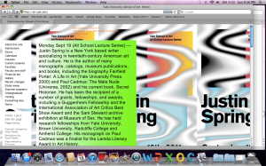
Bad: Yale School of Art http://art.yale.edu/
Now I know that this site is a Wiki and that anyone with a school ID can add to, or alter it, but why would you allow your department to have a site so horrific to look at? I don’t think its necessary to explain what makes this page so bad. My main complaint is the colors that make it almost impossible to read let alone look at.


First of all, Sara, anyone who loves “This American Life” as much as I do gets a thumbs-up in my book. Secondly, I agree with your assessment of Brain Pop. I wish I had thought of it. I don’t use it as often since I began teaching high school a few years back, but when I was teaching 4th and 5th grade, I used it constantly. For a robot who doesn’t speak, the kids sure find a way to attach themselves to Moby!
I was just looking through your past posts and came across this one. Your example of a bad website stood out to me because I too came across it when searching for poorly designed websites. I was so baffled by the design of this website that I didn’t think it was actually the site of Yale School of Art.
I don’t have any sort of artistic background so I wasn’t sure that my opinion of this site was very valid. I really thought that this was a terrible idea and that the site was ugly and confusing. I appreciate the creativity in allowing anyone with an ID to edit it, but I don’t think it worked out very well in this case.