Monthly Archives: October 2011

Image

Incredible @rt Department


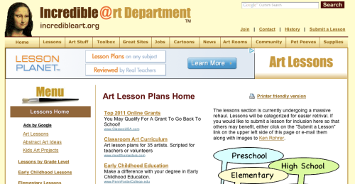
I use this site every once in a while. It has some useful information and lesson ideas. It has a similar concept to my that of my course project but even though I do use this site, I don’t really like it.

I’m not sure what exaclly it is that bothers me, the dull color scheme, or the cluttered layout, or the over whelming number of drop down page choices. I want my site to have useful information, like this site, but I want to have the information in a more organized and less cluttered layout…and a better color scheme. Screen shot 2011-10-19 at 11.07.00 PM

Educational Podcast

Learn Out Loud

http://www.learnoutloud.com/Catalog/Arts-and-Entertainment/Painting_-Architecture_-and-Sculpture/Art-History-Podcast/24148#

This website has podcasts for every subject area. Being an art teacher I chose to listen to the ones in the art history podcasts.

The first on the list is about the painting titled, The Gleaners, by Jean-Francois Millet. It begins by stating the name of the painting, the period, and the art movement it belongs to. The narrator then describes the work, giving the listener a vivid mental picture, almost like the start to a story, describing the characters and what they are each doing and wearing. Many details the viewer may not have noticed other wise. Students may only look at a work for a minute or two, this podcast is about 5 minutes long, and held my attention through the thoughtful analysis. I also liked that the image is available on the page but  isn’t visible while you are listening, unless you open the file separately yourself, so that you can fully use your own imagination while listening and look later if you choose.
Text and Images in Website Design

I was looking for good and bad use of text and images on a website. Here is what I came up with:

Good:

www.wikipedia.com

I like wikipedia’s simple layout, not overly cluttered. Clear and easy to use. The clean white background allows the user to focus on the text, which is dark (black and blue) and easy to read against the background. There are not too many choices of where the used should go from here, either choose a language or enter what you are looking for in the search bar.

unlike….

Bad: www.about.com

This website is overwhelming. There are way too many images and text. They have filled an entire page with blue hyperlink text, 5 columns of it! Nobody wants to scan that much text to find what they are looking for. They have used every color possible when listing the various categories. This could have been done in a simple list form.